
SPORTS DIRECT
Concept Development / Key Art / Typography
Agency: Cowshed
BRIEF
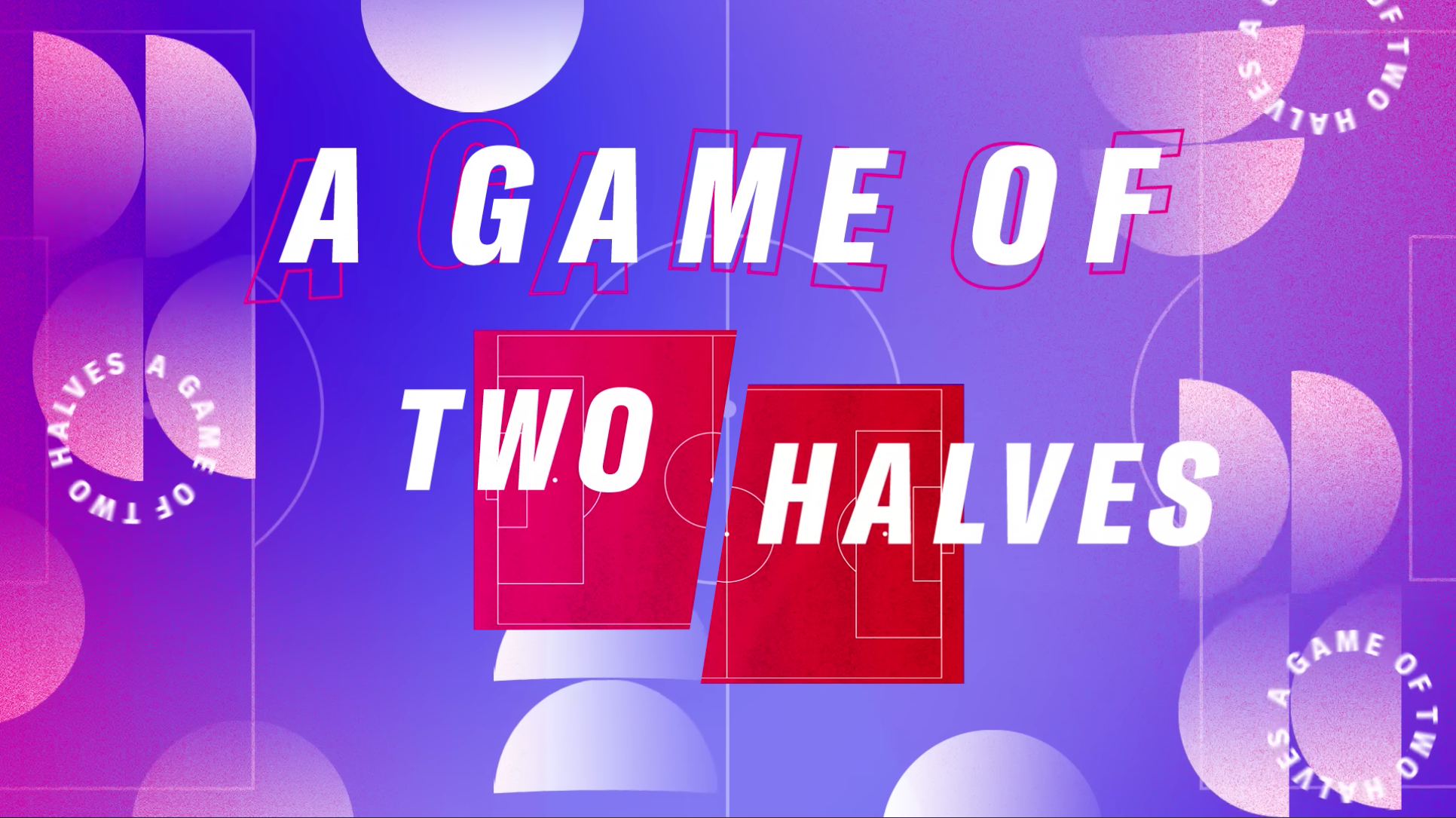
Sports Direct wanted to refresh the visual identity of its YouTube series A Game of Two Halves, creating a stronger graphic system that could extend beyond the title sequence into the wider programme.
SOLUTION
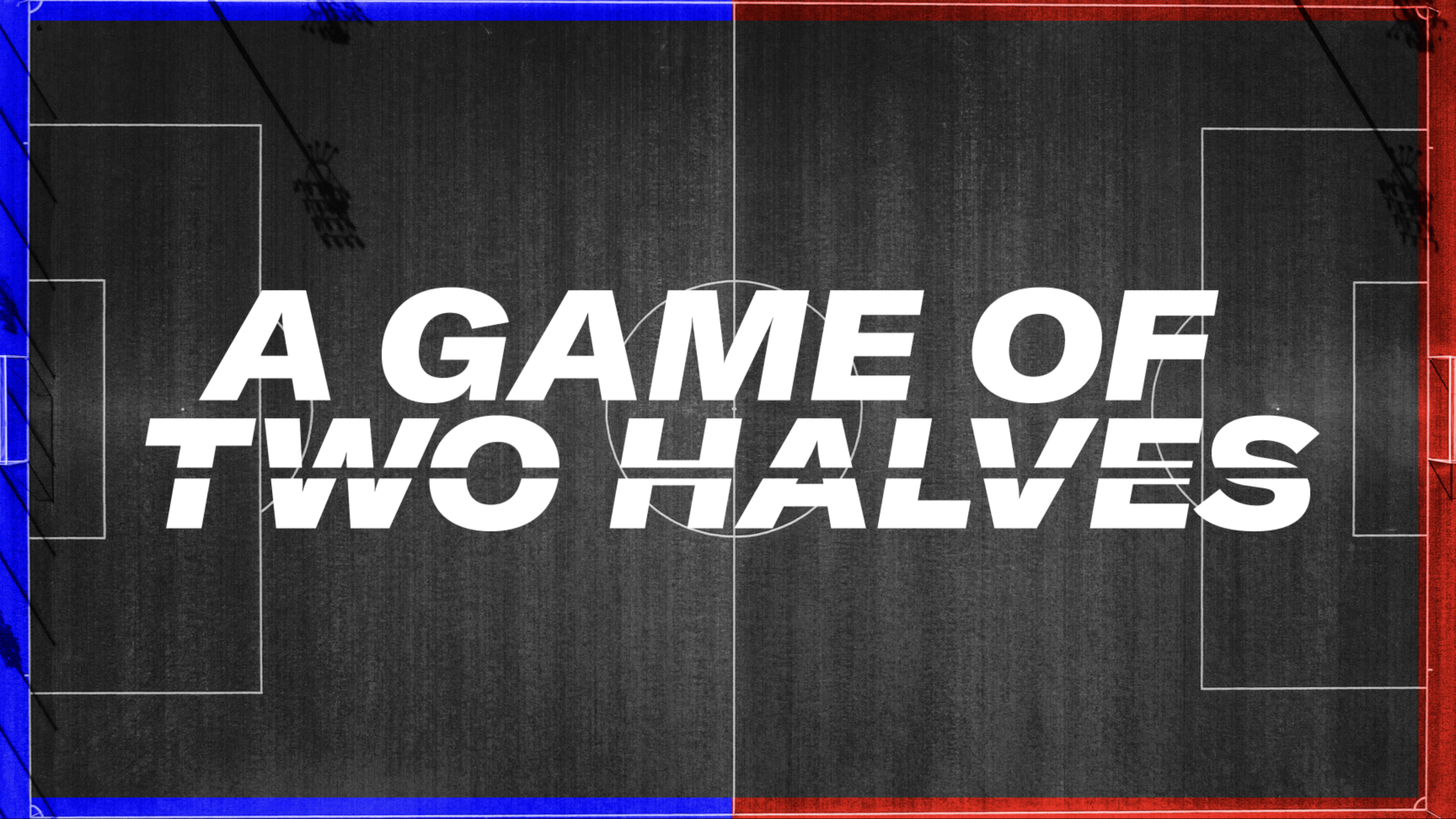
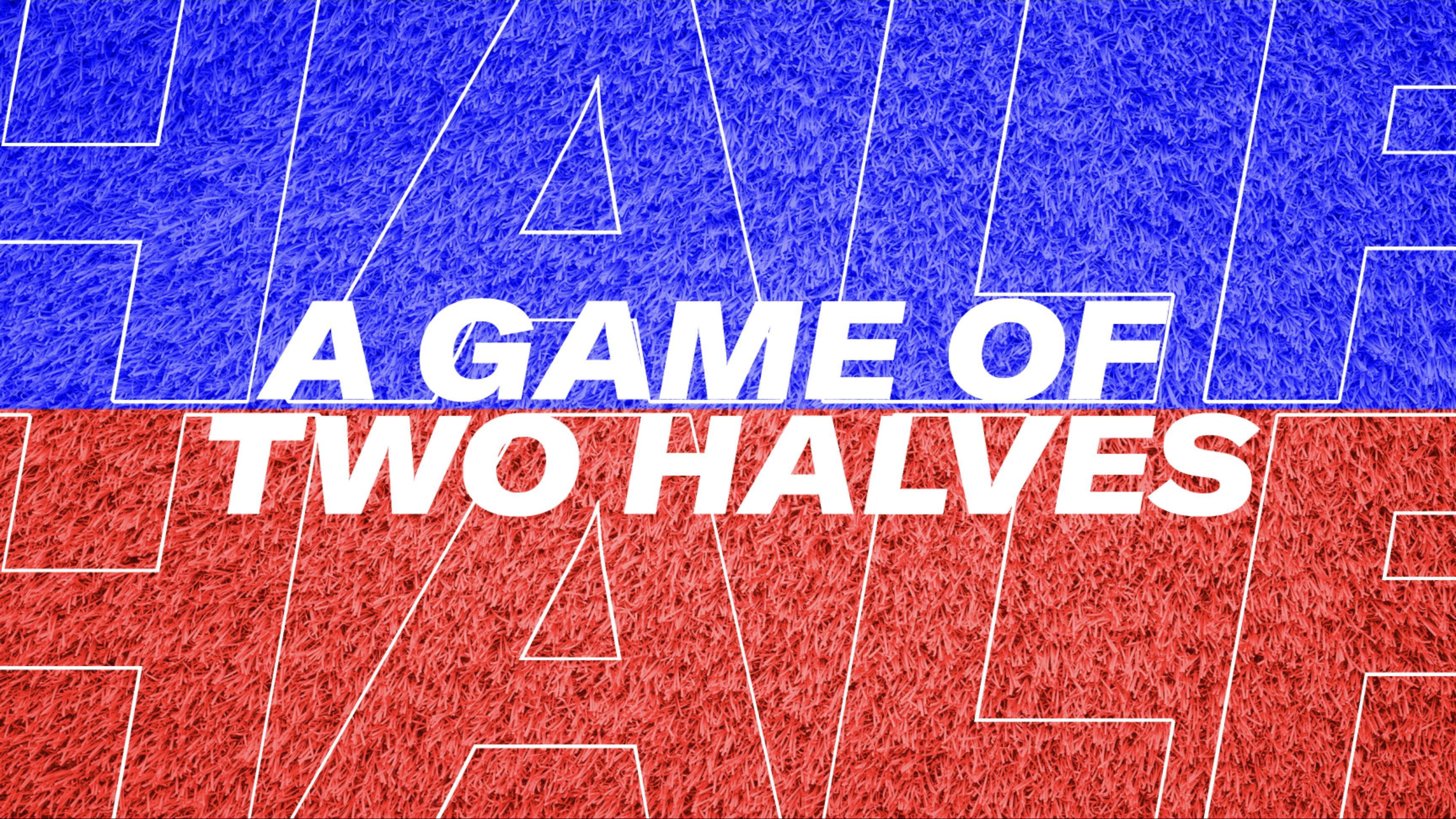
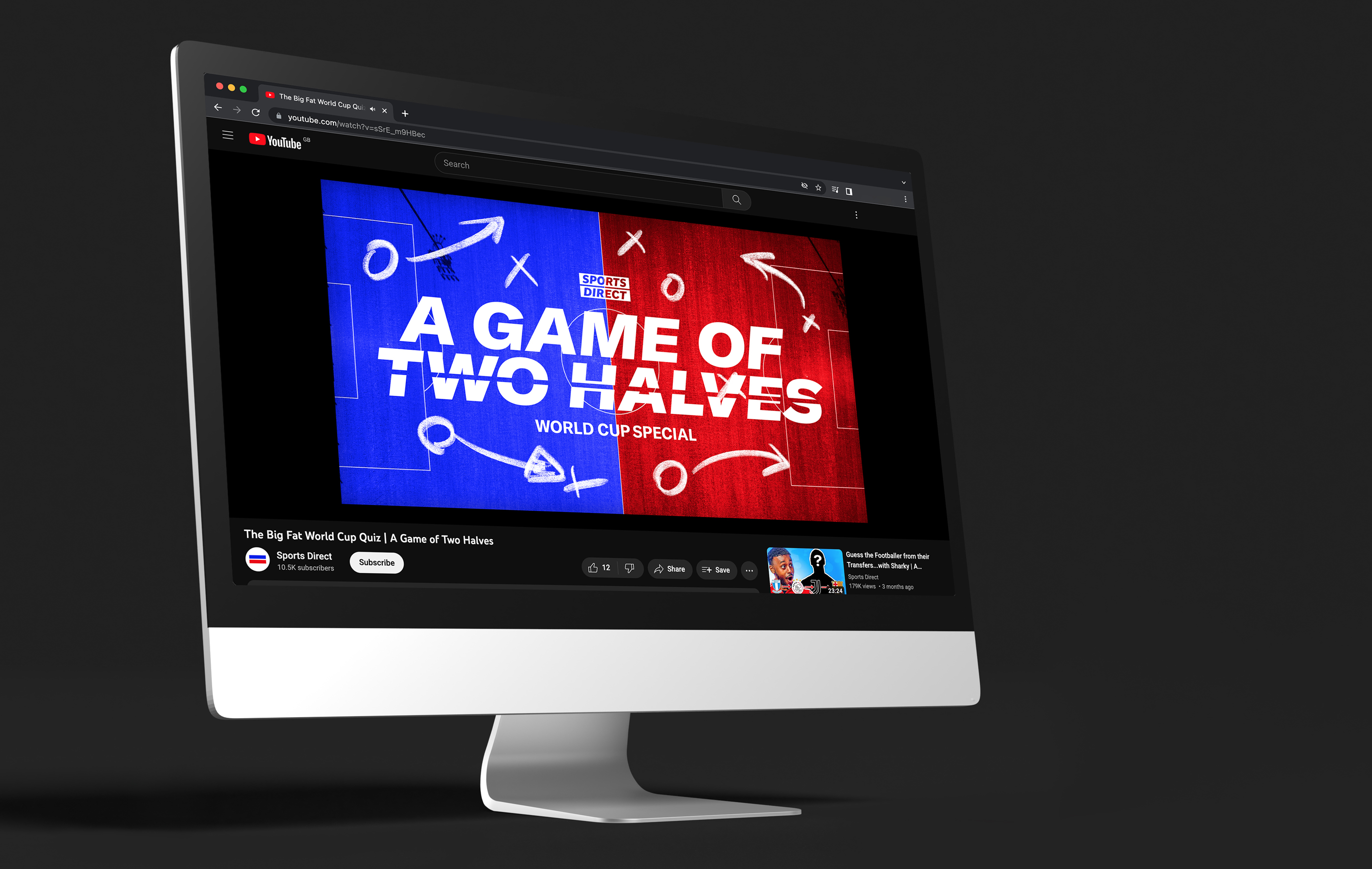
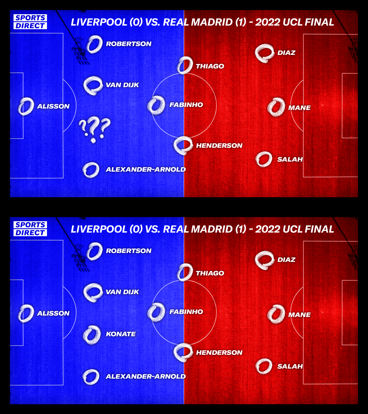
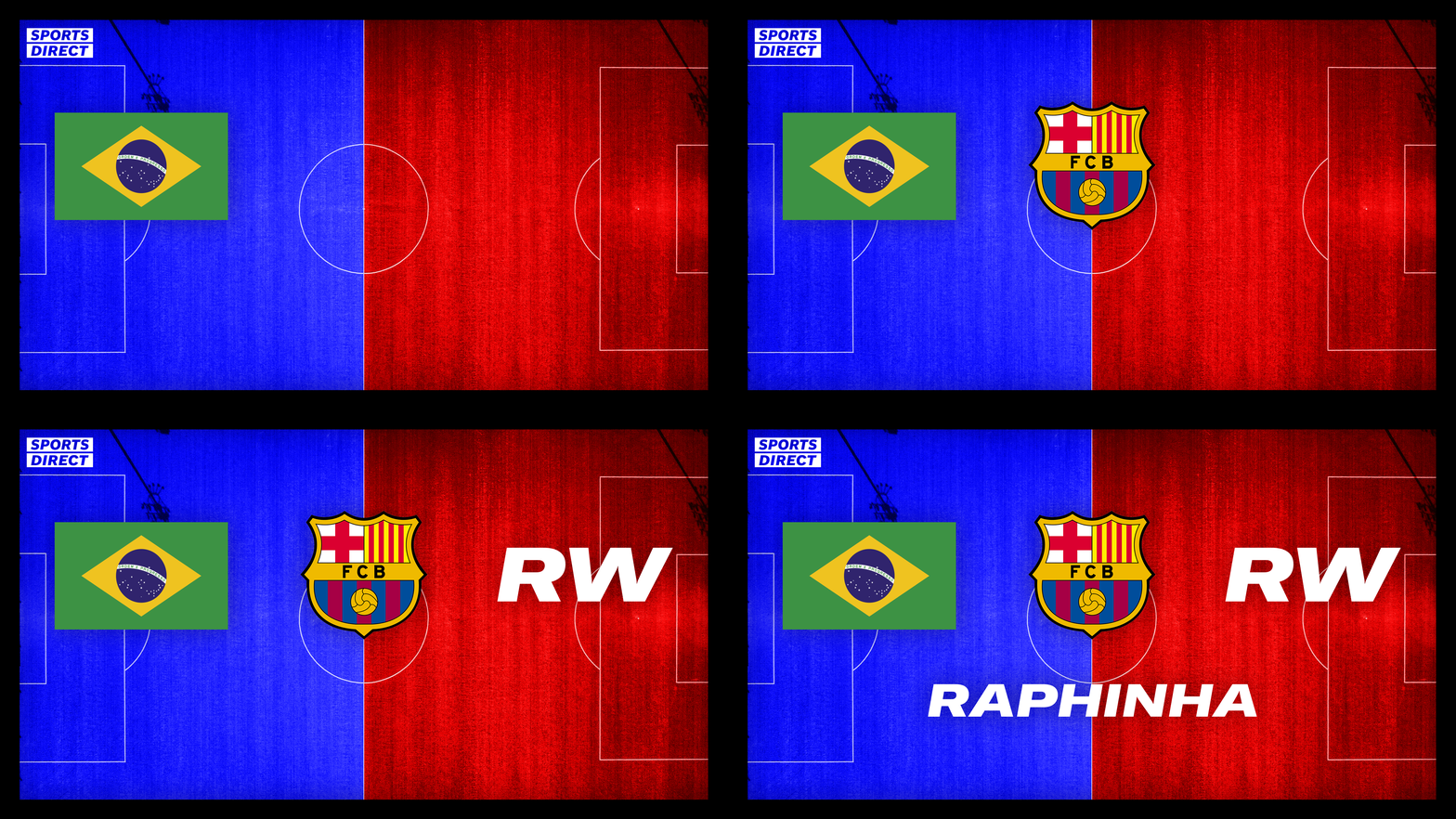
Beginning with an exploration of typography and inspired by classic football tactics boards, I developed a contemporary visual identity combining bold type with hand-drawn graphic elements, and extended the visual system from the title sequence across the show’s on-set graphics and supporting assets, creating a consistent identity throughout the programme.

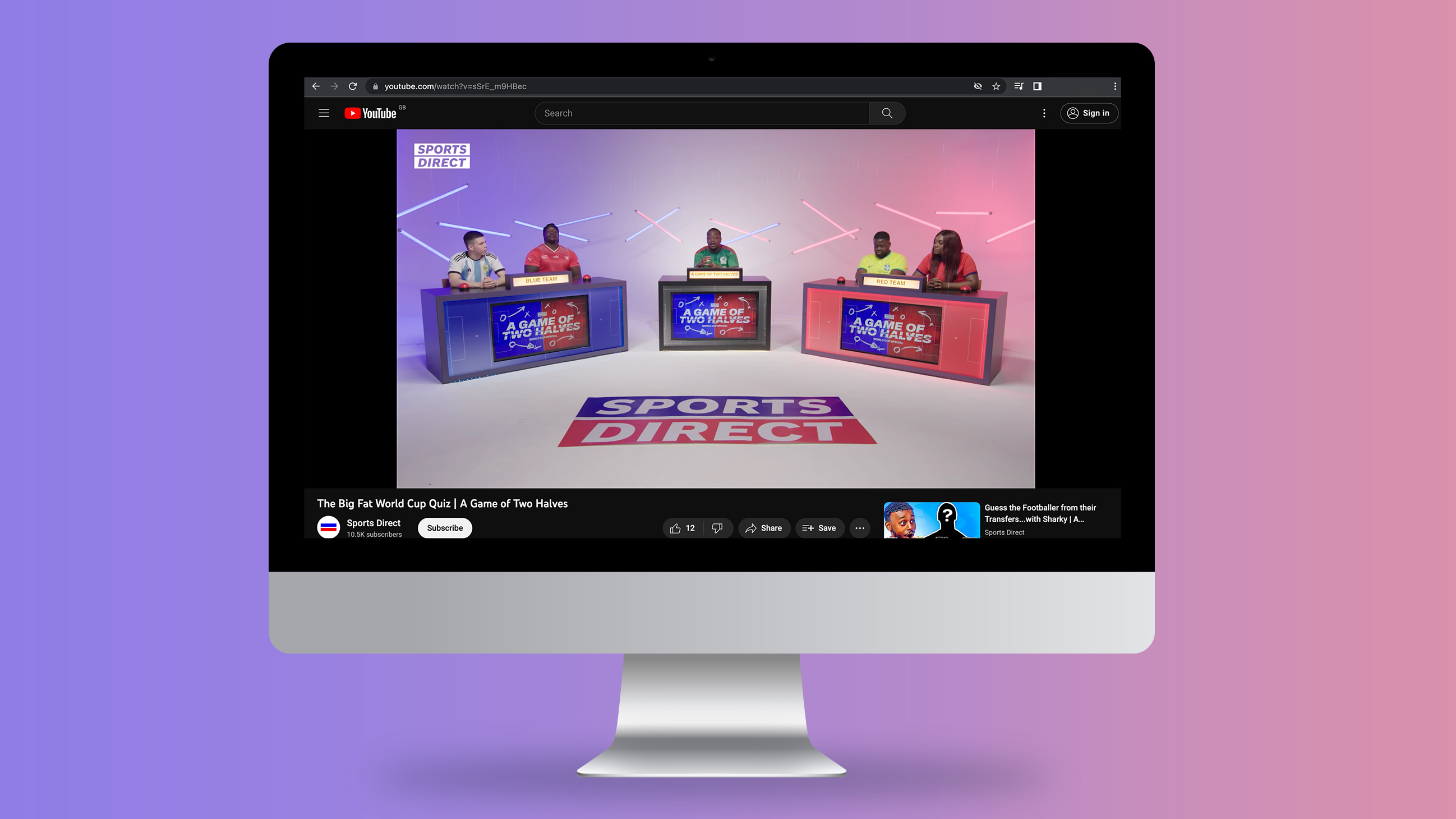
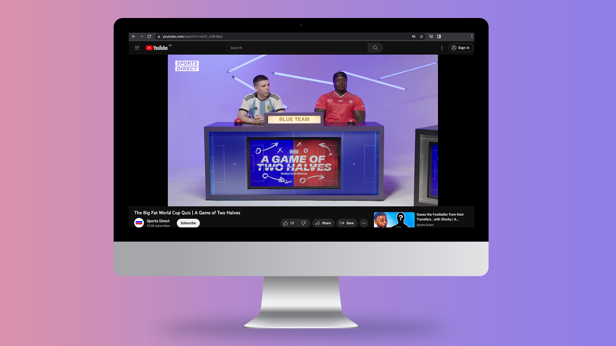
Game show graphics
The visual language established in the title sequence carried through to the in-show graphics, creating a cohesive identity through shared typography, colour and hand-drawn chalkboard elements.
Get in touch
MORE WORK




Rohit Sharma | Senior Designer & Lettering Artist

